|
|
|
|
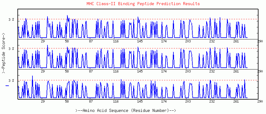
GRAPHICAL OUTPUT-1
(Score Distribution Profile)
An example output of Antigen 85B (M. tuberculosis).
The horizontal scale marks overlapping peptide frames moved in steps of one amino acid. The peptide frame score, calculated with quantitative matrices extracted from literature by Sturniolo et al., 1999 is plotted on Y-axis. It has been shown that this calculated score correlate with the MHC binding affinity of peptide. Each box represent a results of separate MHC allele. User selected threshold is represented as dashed line that changes color from blue to red if any of the peptide frame score more than threshold or in other words are predicted as binder.
A peak crossing red line means predicted
binder starting from amino acid under peak to nine amino acids ahead.
This out put is a quantitative way look at prediction results, predicted
binders and other regions in antigen sequence.
|
|
|
|